00.Global_10.Misc_components_h_tabs

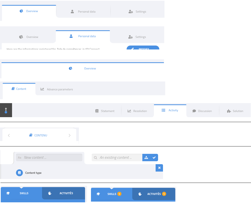
The platform uses tabs in three ways:
1) In the main section, to show different aspects of the currently selected object.
The design shows different situations:
- regular, with the first tab selected
- regular, with the second tab selected
- special case if there is only one tab. Optionally, it could just be invisible.
- special case with only two tabs, we don’t use the whole width
- special cases with the tabs on the right. TODO: discuss with designer if this is needed.
On mobile, we only show one tab, with arrows to switch to the next or previous.
TODO later: we need something hybrid in case there are too many to display on one row
2) At the bottom of some lists, to add items to the list.
It looks like tabs, but may not be considered as a tabs components, more of a specific UI.
3) In the navigation panel.
These are a bit special and maybe not a tab component, given their special behavior.