00.Global_10.Misc_components_f_buttons

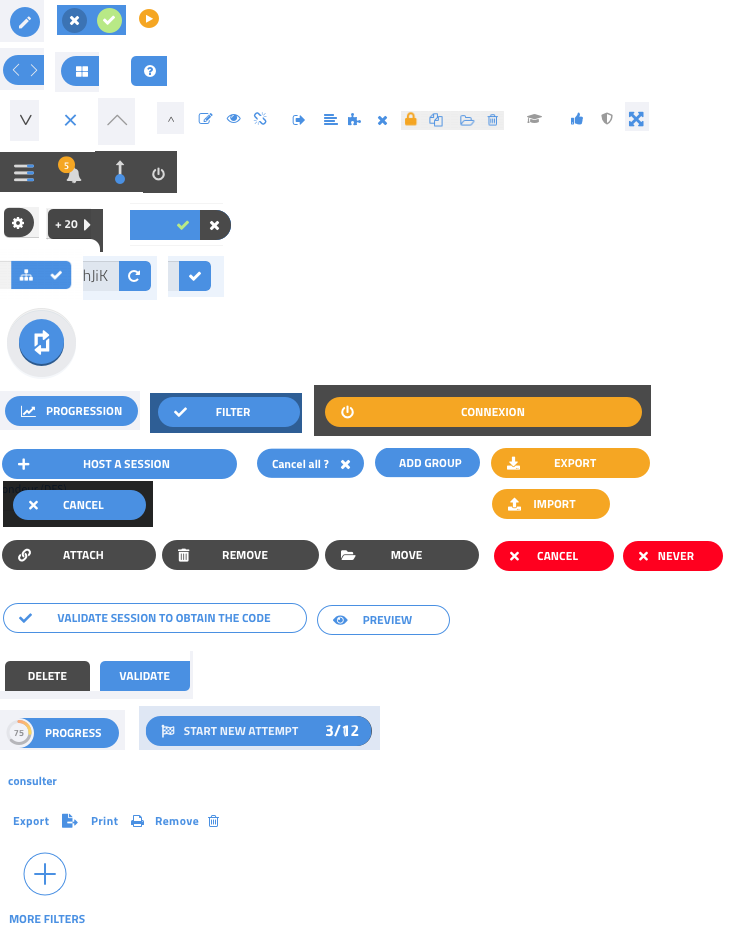
The platform contains different types of buttons:
- small round buttons, for example used in the title bar
- half-round buttons to be attached to the right border. TODO: do we need the third one?
- icon buttons with no dedicated background
- same, but on a dark background. These may have multiple colors.
- special buttons for the grids, may be handled specifically
- buttons on the right side of input areas
- a special “switch rows/columns” button for the grid
- text buttons with an icon on the left, in blue, orange, dark gray, red, white with a blue border
- a different type of text button, for the bottom right corner of some forms
- special buttons that include a score ring on the left, or some numbers on the right
- links with no button shape, just a word
- links with an icon
- a special button for adding filters. Ignore for now, we may not use it.
All buttons should have a “pressed” state and a disabled state.