00.Global_08.Forms_a_overview

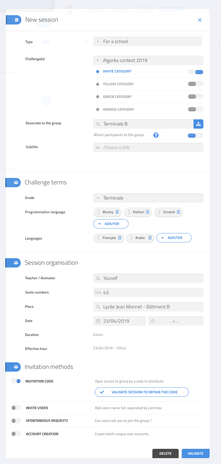
The UI contains a number of forms, which should have a common look and should be easy to implement using a set of reusable components.
Forms are divided into sections and subsections, each with a set of fields. There may also be read-only data displayed within the forms, or other types of fields. Some fields may be optional, others required, and different types of help may be provided.
Some fields may have subfields.
Forms may display errors when some provided input is invalid.
Some sections of the form may initially be locked and made available only when some other fields are already filled.
There are several types of buttons to validate or cancel the form.
When the label is too long, it should automatically be split into multiple lines
A form may contain other interactive aspects, such as action buttons